Step 1: What Should I Bring to the Presentation?
This is the perfect checklist for an architectural presentation:
- Laptop: This is in case there is nothing else to show the slideshow on. It also helps with putting in last minute corrections. Make sure the most recent version of the PowerPoint is saved on this laptop in both PowerPoint and PDF form.
- Portable Projector: Not all offices or businesses have a projector in the house, so it is a good idea to bring one just in case.
- USB Stick: Have the most recent version of the PowerPoint saved in both PDF and PowerPoint format. This will help in case there is a problem with your laptop and you need to show it on someone else. It also helps if you're not able to make the presentation yourself for some reason, and someone can take it and fill in for you. This is also applicable if you are running late so someone can get the presentation set up while you are on the way.
- Handouts: These are great for allowing your audience to follow along as you speak and make things easy for audience members to go back to things you had previously mentioned. It also serves as something for them to take home or to the office and look over with other decision makers.
- Extension cable: You never know the layout of the room you are presenting in, and the outlet might be on the other side of the room from where your projector needs to be set up. Be prepared!
Step 2: Practice, Practice, Practice!
Present as often as you can to different people in your office. Make sure you have done your research. I'm sure you've been to presentations where you can tell somebody is just reading off the slides. Become an expert on the topic of the presentation so you can improvise. One of the most important rules for presentations is to never read verbatim what is on the screen. Your audience can read it for themselves, so it is a waste of breath for you, and boring for them.
For those who hate speaking in public, practice is even more essential. The more you practice the presentation, the easier it will become to present it in front of people, especially for those with stage fright. I previously had a fear of public speaking, and the way that I got over it was volunteering for every opportunity to speak. It was terrifying at first, but with time, it will become easy for you. I went from my knees shaking whenever I had to speak in class, to introducing my thesis class presentation in college. This process can take time, but the practice is key.
Step 3: What Kind of Graphics Should I Use?
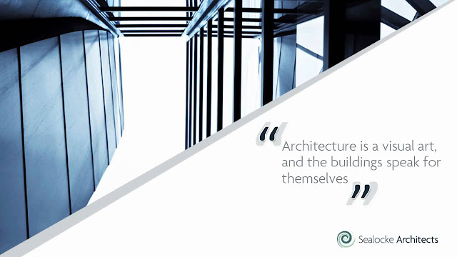
The kind of graphics is really up to the presenter based on the type of presentation. Powerpoint and even Prezi formats offer many different ways to showcase information. You can use quotes, graphs, tables, pictures, and videos to get your point across. The important thing to note here is that not all photos are made equal. Make sure to check your picture quality on the large screen, to make sure it is not pixelated.
However, bigger is not always better. A powerpoint full of extra high-quality will be huge, and make transferring and sending it to people a hassle, especially in times of tight deadlines. If you see your megabytes going up, you can compress your photos within the Powerpoint, or compress the entire presentation after saving it as a PDF.
 |
| Picture Source: Sealocke Architects |
Step 4: Pictures Speak Louder than Words
Have you seen the slides where it looks like somebody copied an entire book and just pasted it on the screen? Entirely illegible, and the presenter feels the need to read through all of it? Why would you want to subject someone to that? Many people have a system for fixing this, giving sets of rules and guidelines for how many words or lines you need per page.
The solution I like to use involves using almost no text at all, and relying on pictures and graphics and possibly a short quotation to get the point across. You should not have to read off information for your audience, and if you've provided them with a handout, then they can just read it for themselves. Architecture is about showing a story through pictures, whether heavily rendered, or simple conceptual sketches. You should be able to have the same level of composition of thought in your presentation.
Step 5: Show Only The Relevant Information
Nobody likes repeating information. Nobody likes repeating information. Nobody likes repeating information. It is annoying for the person who is presenting the information and annoying to the people who are forced to listen to it. Unless you need to emphasize a specific point, you should not do it. If you must repeat it, make sure it is addressed within the new context. In other words, don't put things the same way, make sure it is mentioned only to reinforce a new point.
Step 6: Think About Your Audience
Is this a government project? Is it a house you're designing for a family? Is it for business? Make sure you cover the key points that they will be interested in. It is important to outline the project, and list the key points for your audience at the beginning of the presentation.
The way you present yourself to your audience is also important. Do you need to be engaging and charming or do you want to wow them with your knowledge of the facts? make sure, no matter who you are presenting to, that you are always dressed professionally. First impressions are important, and you never know who will be attending the presentation.
Depending on what phase of design you are on, the client might want to know different things. However, at the very least, make sure that these 3 things are clear in your slides: what you have done, where you are now, and where you are going. These 3 things are key at almost any stage, to give the client an idea of what you've been working so hard on, as well as what they can expect for the next phase.
Step 7: Make Following-Up Easy
Make sure you always bring business cards to presentations and bring lots of them, you never know who will be coming to a presentation. If you present well, an audience member may even become a future client!
You should also make sure it is clear on all the literature you bring who is giving the presentation, and who the consultants are. People need to know that information, and it gives you greater credibility for stating your sources. Make sure to bring an attendance list to all of your presentations, even if you know the people who are going to be there because sometimes unexpected people show up, and being able to reach people is important.
Step 8: Typos. Please, No Typos.
Nobody wants to have a sloppy presentation, and some things, like having the wrong project name, can be horrible. Please have at least 2 people in your office look at your presentation before you send it. Make sure one of the people is working on the same project as you so they can point out any wrong information, or changes that have been made. The other should be the person in the office that is the best with writing and grammar so any spelling errors can be avoided. This can apply to oral, visual, and drawn presentations as well.


